
Recently, a number of top luxury brands have revamped their brand logos. If we look at new logos, there is a common: brands have cut out the symbols of heritage and history (visual and artistic fonts) from logos, and rolled out new logos with nothing but straightforward capitalized alphabetic letters. It looks like to design the new logos, these billion dollar businesses just asked a design intern to type out the brand name in default fonts that come with Microsoft Word. Make them bold. Viola! Job done!
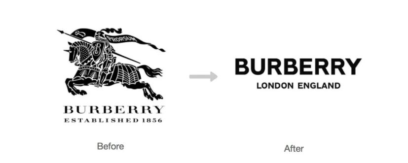
Burberry changes logo in August, 2018
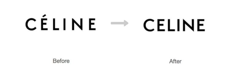
Celine changes logo in September, 2018
What is the real story behind it? Why are so many luxury brands revamp their logos toward the same direction?
Logo and branding
What is the relationship between logo and branding? What are the impacts on brand positioning if luxury brands change logos? Or vice versa? To answer the above questions, semiotics is the key.
Semiotics is the study of meaning-making, the study of sign process and meaningful communication. One of the founding fathers of modern semiotics is Swiss linguist Ferdinand de Saussure (1857-1913). He defined that every linguistic sign consists of “signifier” and “signified”. De Saussure’s theory offers a different approach to understand the world.
The signifier is a letter, a word, a sound-image, or, a logo.
The signified is the concept, the meaning, the thing indicated by the signifier. It can be a concept, an entity, a person, or, a brand.
Signifier and signified cannot be conceptualized as separate entities, but rather as a mapping from significant differences in sound to potential (correct) differential denotation. For example, in English, the sound or the word of “T-R-E-E” means tree, while in other language systems, the meaning can be gate, sky, or potentially any other things. As De Saussure explained - the connection between all “signifiers” which are “sound images” or “linguistic signs” and what they are signifying – their signified object or concept – is arbitrary.
In brand communications, a logo is the immediate representation of a brand. For instance, the swoosh represents Nike as a brand.
Each sign is enabled with specific meaning under certain cultural background. One of the most important functions of a logo is “expressing meaning”. A logo, a brand’s most immediate representation of themselves to consumers, tells the brand’s positioning, concept, value, and so much more. If the brand’s positioning has shifted, its logo should be, and has to be, changed accordingly.
All in all, what is the fundamental social economic dynamic changes underpinning the recent luxury brands logo evolution?
01 Targeting younger generation
One finding through logo evolution is that luxury brands are sparing no effort to win over the younger generations. Just to name a few examples in Asian market: Burberry invited Chinese-Canadian actor/singer Kris Wu (born in 1990) as their global spokesperson. Balenciaga designed Chunky Sneakers and was often seen worn by South Korean singer-songwriter, rapper and fashion icon Kwon Ji-yong (G-Dragon) (born in 1988). Luxury brands are exploring in the journey of getting closer to the younger generations.
They want to be seen as helping young people to follow their passion, express their feelings, and simply encourage them to be themselves. Young consumers are ushering in a new era of luxury.
02 Pragmatism and equality
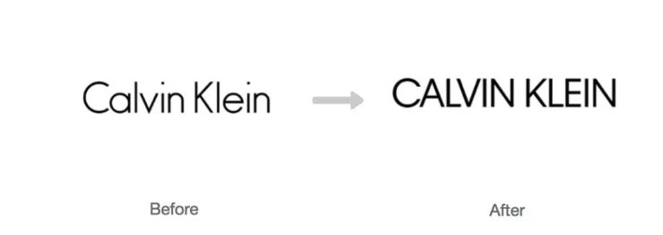
CALVIN KLEIN changes logo in February, 2017
Another finding is that the evolution of logos embraces an all-capitalized, flat typeface. Simplified non-serif font originates from modern art, fusing pragmatism and cutting-edge design.
In the past, luxury goods is a symbol of social status and wealth. As time changes, the concept of luxury itself is evolving. Decorating yourself with fancy jewellery from head to toe is an outdated way of expressing your status, let alone your taste. Instead, leading a life of luxury now means pursuing a higher quality lifestyle, using premium goods/services and appreciating aesthetics.
Simplified and functional logo design leans toward pragmatism and equality, and at the meanwhile making the brands more approachable towards consumers.
03 Simplification and minimalism
Compared to previous logos, new ones look simpler and minimalized. Burberry completely dropped the chivalry image and kept only bold letters; Celine dropped French accent and reduced spacing between letters; Yves Saint Laurent rebranded its prêt-à-porter business unit by cutting off Yves from its name and changed the brand logo to simple letters.
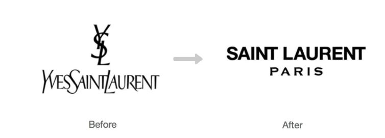
Yves Saint Laurent's prêt-à-porter business is renamed as SAINT LAURENT PARIS in July, 2012
With the world moves even faster, people’s attention span keeps shrinking - even for visual elements. Many people are losing patience for brand stories with long histories, or logos decorated with complicated details. Simple and clear information is the key to effective communication with consumers.
Implication for other brands
Logo plays a critical role for branding. If designed and marketed correctly, a logo can serve as a powerful ultimate source where consumers can feel a brand’s positioning and value, which is aligned based on the findings from cultural insights. Even a brand with long history doesn’t have to stick to the original logo, simply because revamping a brand’s logo doesn’t mean entirely throw away its history and heritage. Reserving the tradition and adopting the current trend can walk hand-in-hand.
No brand exists in a vacuum: they have to understand the culture of the universe around them. That’s why the most successful brands are the ones with a clear cultural role to play in the society they exist and grow.
We come across with so many long-history brands every day. Regardless of consumer brands, such as McDonald's, Coca-Cola, Apple, Siemens, Lego, or business and premium brands, such as IBM, Xerox, Mercedes-Benz, BMW, they all have revamped their logos several times along their history. It’s not a sign of lacking confidence. On the contrary, it manifests that a brand is willing to embrace change and is always ready to follow, or even to lead, the latest trend.
Kantar Consulting cultural insight team are experts in understanding how brands can connect with culture. We measure a brand’s cultural vibrancy and mine culture to find insights through semiotics. We can help brands to increase their share of cultural conversation, therefore ultimately switch on growth.
EDITOR'S NOTES
* To reach the author, or to know more information of brand cultural insight consultancy in China and other parts of the world, please contact us.