
Key takeaways
- Well-designed survey scales reduce bias and noise, leading to clearer and more actionable insights.
- Different scale types—such as Likert, semantic differential, rating, dichotomous, graphic, and numeric—serve distinct research purposes.
- Design choices like unipolar vs. bipolar structure, anchor labeling, and number of scale points significantly impact response accuracy.
- Selecting the right scale depends on research objectives and audience context to balance precision and simplicity.
- Best practices include testing scales, using clear labels, standardising order, and ensuring accessibility for reliable data.
How you present questions to participants in surveys influences how they evaluate them. Scales give structure to people’s answers, turning subjective reactions into data that can be analysed, compared, and used to guide decisions. When a scale is well designed, you get clearer insights. When it isn't, responses can become noisy or misleading.
At their core, survey scales provide standardised response options that measure opinions, attitudes, or behaviours. That structure makes it possible to quantify something that might otherwise be difficult to capture.
A well-selected scale can:
- Capture more accurate and detailed responses
- Reduce ambiguity and misinterpretation
- Enable meaningful comparisons across respondents and groups
- Support reliable statistical analysis
- Reveal clear trends and patterns
- Minimise response bias
- Ensure that insights are actionable and genuinely decision-ready
Because of their influence on data quality, scales deserve deliberate attention. The right choice depends on your topic, your audience, and the type of data you need. For brands and organisations working to reflect real consumer behaviour, this choice is foundational. That’s where a research partner like the Profiles team at Kantar can help—bringing experience, methodological rigour, and deep knowledge of consumer psychology to every step of the survey design process.
In this guide, we’ll look at the most widely used survey scales, how they work, their strengths and limitations, and when each one is most useful.
What are survey scales?
Survey scales are tools that turn subjective opinions into structured data. Instead of open-ended answers that must be interpreted, scales give respondents a set of defined options. This lets researchers quantify reactions and compare results across people, markets, segments, or time.
So, what exactly goes into building effective survey scales? Let’s explore some key factors involved in their construction.
Constructing survey scales
Unipolar vs. bipolar
Unipolar and bipolar scales are two common approaches for capturing how people feel about a product, experience, or idea, but they measure attitudes in different ways.
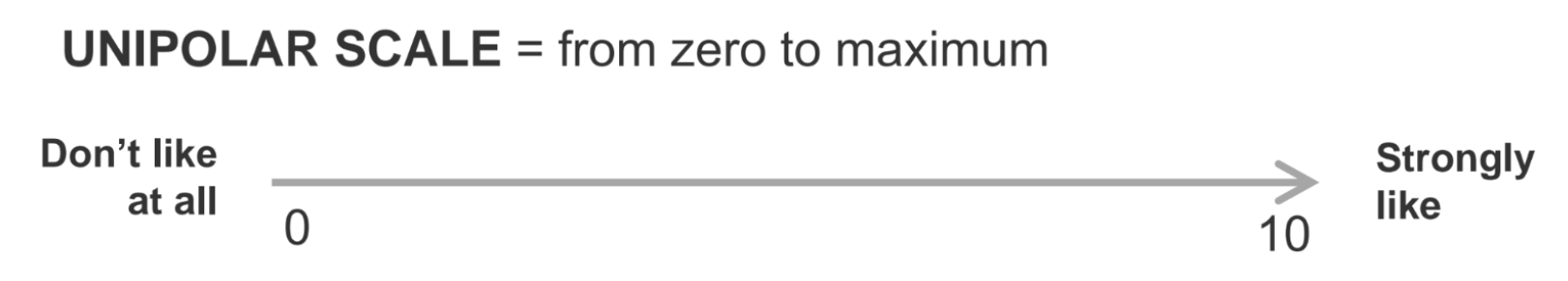
A unipolar scale asks respondents to rate the presence or intensity of a single attribute, such as how satisfied or interested they are. These scales reflect varying levels of some construct or attitude with no conceptual midpoint:
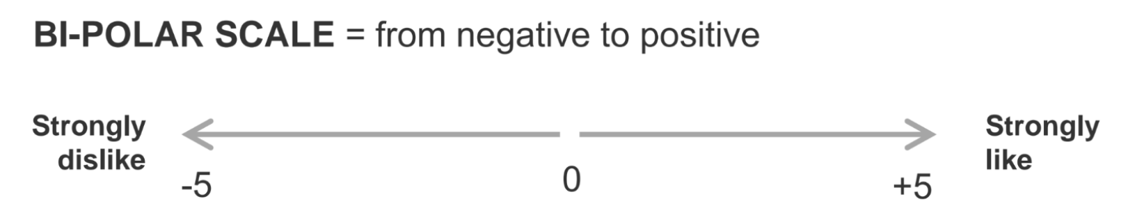
A bipolar scale measures attitudes along two opposing ends, like satisfied versus dissatisfied or pleasant versus unpleasant. These scales reflect two opposing alternatives with a clear conceptual midpoint:
Understanding the difference between unipolar and bipolar helps researchers choose the format that best fits their objectives and yields clearer, more reliable data.
Some measures naturally fit a unipolar scale — for example, “interest,” since “strongly uninterested” doesn’t really make sense. Others are better suited to a bipolar format or can work effectively in either direction, depending on the research need.
Label anchor effects
Often creating a survey scale question involves a balancing between the answer variability you want to obtain and the ease at which respondents can answer.
How you label you scale also can dramatically impact the balance of responses your survey yields.
- Fully anchored: Labels on every point of the scale
- End anchored: Labels only at the end of the scale
- Fixed anchor labels: Like or dislike
- Comparative anchor labels: Like best or like least
Number of scale points
Additionally, choosing the number of points on a scale affects how much nuance you can capture and how easy the question feels for respondents.
For example, odd-numbered scales give people a neutral or middle option, which can reduce frustration and reflect true indifference. Even-numbered scales remove that midpoint and push respondents to lean one way or the other.
Below are some common scale point numbering formats you’ll find in surveys:
- 5-point scales: Quick and easy for people to answer. Good when you want simplicity without losing too much detail.
- 7-point scales: Offers more range and tends to produce richer variation. This is one of the most commonly used formats in survey research.
- 10-point scales: Provides even more granularity but takes longer for respondents to process. Often used for measuring satisfaction or performance because the added spread can be helpful.
- Continuum scales: respondents are not restricted to selecting from marks previously set by the researcher.
Types of survey scales
To understand scales more clearly, it helps to look at common types used in research. Each one supports different kinds of analysis and has different implications for survey design.
Below are commonly used scales in survey research, along with guidance on when each shines.
Likert scale
A Likert scale is often used to measure people’s attitudes and opinions. You have likely seen this type of scale used to measure agreement or disagreement with a statement.
Example: “How much do you agree or disagree with the following statement: The ad captured my attention”? Strongly agree, Agree, Neither agree nor disagree, Disagree, Strongly disagree
Pros:
- Universally familiar and easy for respondents to understand
- Works well for attitudes, beliefs, and perceptions
- Flexible across many topics
- Does not require concrete yes or no answers, allowing responses in a degree of agreement, importance, etc.
Cons:
- People tend to use the middle response category of a rating scale regardless of content (e.g. centrality bias)
- People tend to accept or agree with statements regardless of content (e.g. acquiescence bias)
- Doesn’t explain why someone feels a certain way
- Intervals between points on the scale are assumed to be equal
This scale is ideal when measuring general sentiment or tracking shifts in perception over time. It is also useful when the items being measured are not homogenous but still need to be compared.
Semantic differential scale
This scale uses pairs of opposite adjectives to measure attitudes on a continuum. End points are typically associated with bipolar labels that have semantic meaning.
Semantic differential scales differ from the Likert scales in that opposite statements of the dimension are placed at the two ends of the scale and respondents are asked to indicate which they most agree with by placing a mark along the scale.
Example:
Anchor 1: My day-to-day life involves very little use of AI technology
Anchor 2: AI technology is essential. I could not get through my day without it
Pros:
- There is no need for scale points to be individually identified
- Bias towards agreeing with a statement is avoided, as both ends of the scale must be considered
- Great for capturing emotional reactions
- Helps measure brand personality or product identity
Cons:
- May oversimplify complex opinions
- Attitudes can be difficult to express concisely
- Adjective pairs must be chosen carefully as it can be difficult to find an opposite to ensure that the scale represents a linear progression from one end to the other
When using semantic differential scales, it is important to keep in mind that any statements used should be kept as short as possible due to the need for respondents to read and understand fully both ends of the scale.
Rating scale
Continuous rating scales ask respondents to place a mark on a continuous line, usually through a slider. Instead of picking from preset categories, they can choose any point between two endpoints.
Example: A slider from Very dissatisfied to very satisfied.
Pros:
- Offers granularity
- Easy to quantify and analyse
Cons:
- Respondents interpret numeric scales differently
- Larger ranges can create confusion
On the other hand, comparative rating scales ask respondents to judge one option against another. Instead of rating items independently, respondents compare two or more options directly.
Example: “Which product do you prefer?” Product A, Product B
Pros:
- Great for competitive or preference-based research
- Highlights relative differences
Cons:
- Doesn’t reveal why something is preferred
- Limited depth
In short, continuous rating scales are ideal for measuring intensity and subtle differences while comparative rating scales are better for understanding preferences, trade-offs, and relative performance across options.
Dichotomous scale
A dichotomous scale is a type of measurement scale that offers only two possible response options, typically representing opposite categories. It’s used when you need a clear, binary choice.
Example: Yes or No. True or False.
Pros:
- Quick and simple for respondents to interpret
- Can be useful for screening or when the decision is strictly either/or
Cons:
- No nuance or explanation
While limited, dichotomous scales are efficient for qualifying respondents or establishing basic behaviour patterns.
Graphic scale
A graphic scale is presented to respondents visually so that they can select a position on it that best represents their desired response. In its most simple form, it typically looks like a slider bipolar scale with fixed points verbally anchored at either end. Visual tools such as smiley faces or thermometer-style indicators are common with this scale type.
Example: A smiling-to-frowning face scale.
Pros:
- Engaging and user-friendly
- Helps reach younger or visual respondents
- Work especially well in mobile surveys
- A simple way of measuring attitudes and image perceptions
Cons:
- Less precise than numeric scales
- Usually only practical online
- Can be harder to analyse consistently
Although the data collected in continuous, the measurement will be assigned to categories and treated as interval date for analysis. It is possible to have a large number of very small intervals and the researcher must decide at what level the apparent accuracy of the data becomes false.
Numeric scale
This simple form of scale asks respondents to award a score (e.g., out of 5, out of 10, etc.). The end points are anchored to avoid misunderstanding. It should also be made clear whether the bottom point is 0 or 1.
Example: Please rate us out of ten for how well we performed today (where 10 is excellent and 1 is poor).
Pros:
- Simpler to design than itemised scales when the exact language used for each scale point needs to be considered
- Easy to visualise in charts or models
Cons:
- Respondents may interpret the meaning of numbers differently (e.g. how good is a 7 out of 10)
- Can feel clinical or abstract with the risk of respondents becoming disengaged
Numeric scales are great for multi-country studies to avoid challenges with consistent translations. You’ll also find them with the widely used Net Promoter Score (NPS). However, it is important to keep in mind that numeric scales are not appropriate for indicating choice between two brands, because more positive associations in the higher score would bias response towards that option.
How to choose the right survey scale
Choosing the best scale requires clarity about your goals, your audience, and the type of insights you want to generate.
1. Focus on your research objective
If you need detailed, measurable outcomes—like drivers of purchase intent—numeric or interval scales are ideal. For broader attitudes, Likert or descriptive scales work well.
2. Consider your audience
Younger respondents may prefer sliders or graphic scales. In professional or B2B contexts, numeric and matrix scales may be more appropriate.
3. Balance precision and simplicity
Too much granularity can overwhelm people, while too little can limit insight. Aim for the scale that delivers enough detail without adding friction.
Best practices for using survey scales
Even the best-designed scale can fail if applied improperly. Keep these practices in mind:
- Test your scales on a small sample before fully launching your survey. This helps identify issues with wording, formatting, or comprehension.
- Standardise scale order across your survey to avoid confusion and make it easier to take.
- Keep scale points consistent to easily compare results and avoid minimising chances of error.
- Label clearly so respondents don’t need to guess what each point represents.
- Keep accessibility in mind, especially for visual or slider-based scales.
These steps help ensure the scale works the way you intend and supports the strongest possible insights.
Survey scales are the foundation of strong quantitative research. Each scale type brings unique strengths and limitations, and choosing the right one can dramatically improve the accuracy, clarity, and utility of your data. Whether you’re measuring satisfaction, testing a new concept, refining brand positioning, or understanding consumer preferences, the scale matters.
Experimenting with different scales and matching them to your goals can help you uncover deeper and more reliable insights. It also ensures that your data is truly actionable, giving you confidence in the decisions you make.
For organisations looking to elevate their research, partnering with experts makes a meaningful difference.
Want to learn more?
Speak with our award-winning market research team to see how we collect high-quality data from online panels and trusted sources—so you can move fast and act with confidence.
Or watch our 21-minute training session, The Effects of Scale Designs on Answers. There you’ll see how different question designs affect survey results and how to choose the right scale for your needs.