

Aggregating survey data is a key component of market research. But extracting meaningful insight from that raw data is equally important. Here, we walk you through the process of survey data analysis, illustrating best practices for deriving value from quantitative information.
What is survey data analysis?
Survey data analysis refers to the process of using statistical techniques to distil meaningful insights from raw data and help guide business decisions. This quantitative data can be sourced from online panel surveys and can include other first or third-party data sources for enhanced insights.
Savvy brands employ survey data analysis to better understand consumer behaviours, preferences, and opinions. This window into the consumer psyche helps companies make data-informed decisions on everything from pricing to product development. Survey data analysis can also help marketers tailor messaging to better appeal to specific types of consumers.
In return, companies foster brand awareness, boost revenue, and outpace competition. Case in point: According to Mckinsey Global Institute, data-driven organisations are 23 times more likely to acquire customers. These companies are also six times more likely to retain customers and 19 times more likely to be profitable relative to brands that don’t employ data-driven methods.
Despite these advantages, drawing meaningful conclusions from your data requires a systematic approach. For example, before you can even begin surveying panellists, you must ensure that you are asking questions that support your research objectives and will be able to answer your key business questions. You must also ensure that your survey is structured with survey design best practices in mind to ensure your data are not tainted by influences like non-response bias and acquiescence bias.
How to analyse survey data
Survey data analysis affords brands the consumer insights needed to succeed. Rather than rely on gut feelings to make decisions regarding new products or price increases, C-suite executives can make smart, data-driven decisions.
However, to discern meaningful patterns and trends from raw data, market researchers must be methodical in their methods. They must aggregate and “clean” the data, checking for missing values, outliers, and other inconsistencies. They must also contextualise the information gathered, presenting the data in a way that tells a narrative and allows key decisionmakers to extract value.
The steps below delve into these processes in more detail, providing a heuristic for analysing survey data.
Step 1: Design an effective survey
It’s no secret that well-designed surveys increase respondent engagement, overall research effectiveness, and data quality. Ergo, the first and arguably most important step of survey data analysis is to design an effective survey. An effective survey is one that is:
- Mobile-friendly: Your survey must be device agnostic, meaning that it can be completed on whichever device the panellist chooses—smartphone included. Otherwise, your data will not be representative of the target audience. It may also be tainted by non-response bias.
- Short and sweet: As a market researcher, you must be respectful of panellists’ time constraints by designing a survey that can be completed quickly. Ideally, your survey should require no more than 12 minutes to complete—though, less than 10 minutes is even better.
- Meaningful: Since there are constant distractions in this multiscreen world, all survey content should have a purpose directly tied to research objectives and not be repetitive. y All prompts must be meaningful and support your research question.
- Clear and Concise: Avoid verbiage that may confuse your target audience. This includes jargon and industry-specific acronyms. Unnecessarily verbose questions should also be avoided as they may contribute to survey drop-out.
- Engaging: Connect with panellists by incorporating light-hearted and humorous language and iconography when appropriate. Simply put, the less boring you can make the survey, the better.
By designing an effective survey that supports your research question, you can increase the reliability and validity of your data. This makes the remaining five steps of the survey data analysis process much easier, helping you draw meaningful conclusions from your research.
Step 2: Determine what kind of data you are analysing
After conducting your survey, the next step is to determine what kind of data you have aggregated. Data can be categorised into different types based on its nature, format, and level of measurement. Common types include:
Close-ended questions
A close-ended question provides panellists with a set of predefined answer choices to select from. These questions are designed to collect structured, quantitative data. For example, a binary question (i.e., a question with only two answer choices) may ask panellists if they use a specific brand of laundry detergent. In this case, the panellists can only designate ‘yes’ or ‘no.’ The limited range of responses makes data analysis simpler and more straightforward.
Open-ended questions
An open-ended question allows respondents to provide a free-form, unrestricted response in their own words. Unlike close-ended questions, which limit panellists to predefined answer choices, open-ended questions give survey-takers the freedom to express their own thoughts and opinions. Though this can afford market researchers a richer, multi-dimensional view of the respective topic, the resulting qualitative data can be difficult to analyse. Coding open-ended responses (grouping responses into similar themes) is an additional step that can be taken to analyse this data quantitatively.
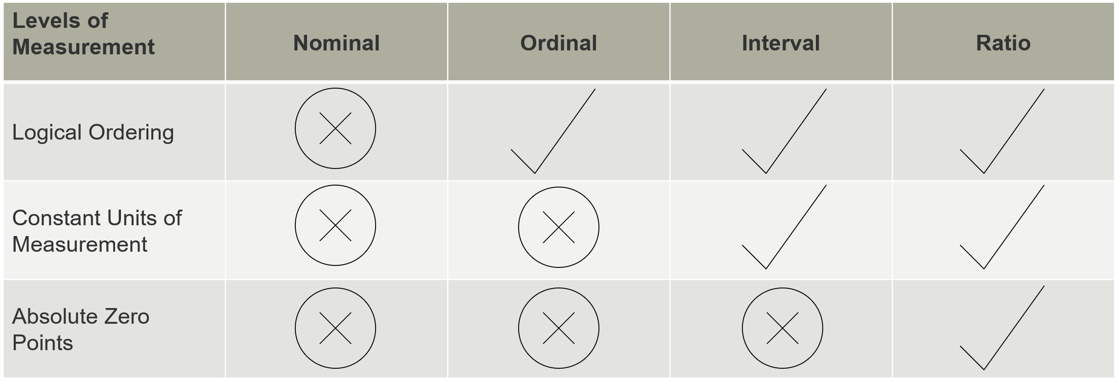
Nominal data
Nominal data is categorical in nature and lacks inherent order or hierarchy. For example, a survey may request that panellists designate their marital status. The answer choices may include single, married, divorced, or widowed. Market researchers can quantify the data using a frequency distribution table. This table organises responses based on count (e.g., 100 panellists designated their marital status as “single”) or percentage (e.g., 20% of panellists designated their marital status as “divorced”).
Ordinal data
Ordinal data is also categorical in nature. But unlike nominal data, ordinal data can be ranked, though the values do not have an even distribution. For example, a survey may request that panellists designate their highest level of education completed. The subsequent answer choices—high school diploma or equivalent, associate degree, bachelor’s degree, graduate degree, doctorate—are mutually exclusive and can be placed in a logical order.
Interval data
Interval data refers to numerical values where the intervals between values are equal and meaningful, like a rating scale. Interval data also lacks a true zero point. In other words, the value 0 doesn’t signify an absence in the dataset. Take temperature as a simplistic example. Though 0°C is a possible data point, it doesn’t mean there is an absence of temperature. Learn how to analyse data from scale questions.
Ratio data
Ratio data is very similar to interval data, the key difference being that ratio data does have a true zero point. Examples of ratio data include income, age, annual sales, market share, and time to repurchase.
Step 3: Cross-tabulate your data
Also referred to as tabulations or cross-tabulations, cross-tabs are tables that display data involving multiple variables. These tables allow market researchers to visualise the interaction between variables, allowing for a more in-depth examination of the data. This typically involves the creation of one table per survey question. The process of cross-tabulation involves placing one variable (such as the question responses) in the rows of the table and another variable (i.e. demographic info, wave of research, product/brand awareness) in the columns. The cells of the table then represent the frequencies or counts of observations that fall into each combination of categories from the two variables.
Cross-tabulation is a key step in survey data analysis because it helps reveal relationships between variables. By examining the frequencies or proportions within the cells, market researchers can isolate associations, dependencies, and patterns.
Ergo, cross-tabulation provides a structured and visual way to analyse data, making it easier to interpret and draw conclusions. The insights gained from cross-tabulation can inform decision-making processes and guide further analysis as well as identify distinct patterns among subgroups (such as men vs. women or users vs. non-users).
Step 4: Analyse the data
Once survey data has been cleaned and prepared, applying statistical techniques can help uncover meaningful relationships and validate findings. Methods such as:
- Correlation analysis identifies the strength and direction of relationships between two variables.
- T-tests compare the means of two groups to determine if any observed difference is statistically significant.
- Regression models estimate how one or more independent variables influence a dependent variable, helping predict outcomes.
- Frequency distributions summarize how often each response or value appears, providing a clear view of patterns in categorical data.
- Analysis of Variance (ANOVA) assesses whether there are statistically significant differences between the means of three or more groups.
- Cluster analysis groups respondents or data points based on similarity, revealing natural segments within the dataset.
- Factor analysis reduces data complexity by identifying underlying variables that explain patterns of correlation among items.
ANOVA (repeated for clarity) helps test hypotheses about group differences, particularly useful when comparing multiple segments at once.
These methods enable the assessment of the strength of associations between variables and determine whether observed differences are statistically significant. These tools provide a layer of analytical rigor, allowing businesses to distinguish between random variation and actionable insights. By grounding decisions in statistical evidence, organizations can move forward with greater confidence and precision.
Step 5: Review the results
You must now review the results from your survey data analysis. To do this, look at the summary statistics you generated during the analysis, such as means, medians, frequencies, and percentages. Pay attention to any noteworthy trends, patterns, or outliers.
If relevant, you may also conduct subgroup analyses based on demographic or other categorical variables. Compare the findings across different groups to identify any variations or disparities. This can provide valuable insights into differences based on factors like age, gender, location, or any other relevant criteria.
Step 6: Determine conclusions
The next step is to contextualise your data in a way that provides meaningful insights. For example, let’s say your research indicates that Millennial respondents are 30% less likely to purchase your product than Baby Boomer respondents. Though this information is valuable, it’s even more valuable to understand why your product isn’t resonating with Millennials.
The “why” may be uncovered using responses from other survey questions, but characteristics of the population and other connected data sources may provide context as well. Consider the demographics, cultural factors, social context, and any other relevant information about the population outside of the survey data. You may also analyse how societal norms, cultural values, and current events might influence the responses and patterns in the data.
In the case of the aforementioned example, you may not be able to pin down the exact reason Millennials aren’t responding to your brand relative to older consumers. However, you may be able to make some conjectures. Demographic information may, for example, illustrate that the younger market segment makes, on average, 23% less than the older market segment. Using this information, you could determine that Millennials lack the disposable income that would afford them the ability to purchase your products.
Step 7: Compare new data with old data
It’s possible your brand has conducted market research in the past. The data gleaned from this research is crucial to your current analysis. Why? Because it helps you identify trends and patterns over time.
For example, if 60% of customers indicated that they were ‘very satisfied’ with your products in 2019, 67% offered a similar review in 2020, and 78% in 2021, you know that your incremental improvement efforts are working. Comparatively, if you notice that customer satisfaction ratings are falling over time, you can opt for a more radical intervention. These comparisons should only be made among data gathered from the same survey instrument, from the same sample sources (or as similar as possible) to be truly comparable. Data collected from different surveys or market research vendors is not comparable.
In a similar vein, comparing new data with old data can help companies assess the efficacy of new programs and initiatives. For example, let’s say a customer satisfaction survey was conducted in 2019 and the survey revealed that only 45% of customers answered ‘yes’ to the question, ‘Did you feel that our team answered your inquiry promptly?’
Displeased with the results, the company implemented stringent customer service protocols in 2020. A year later, the business conducted a second customer satisfaction survey. This time, 89% of customers answered ‘yes’ to the question, ‘Did you feel that our team answered your inquiry promptly?’ Based on these numbers alone, the new customer service protocol could be considered effective.
Juxtaposing new data with older data can also help market researchers cross-validate findings. If the new data aligns with the patterns observed in the older data, it enhances the reliability and robustness of your findings. But if your new data is wildly variable—say, the percentage of consumers familiar with your products falls from 89% to 30%—that may suggest inconsistencies in your data collection, sample quality or analysis methods.
In addition, benchmarking survey results against industry standards provides valuable context for interpretation. It allows researchers to assess performance over time, identify areas of strength or concern, and set realistic, data-informed goals. When used effectively, benchmarking helps translate findings into strategic action by showing where an organization stands relative to expectations or peers.
Step 8: Present survey data
The last step in survey data analysis is to present insights to key stakeholders. Your presentation should deliver the information in a way that conveys a simple yet compelling narrative. This makes it easier for your audience to understand, interpret, and draw conclusions from the provided information, even if they are not experts in survey data analysis.
How to present survey data
When presenting survey data, there are some key guidelines to keep in mind:
- Make it visual: Visual representations like charts, graphs, and infographics are more engaging than raw data, tables of numbers or lengthy textual descriptions. They capture attention and encourage the audience to explore the information further. Visuals also evoke an emotional response, making the data more memorable and impactful.
- Keep it human: Humanising the data with demographic profiles, quotes, and testimonials can help your audience connect with the information. Avoiding overly technical and jargon-heavy language can also make the data more relatable, especially if you are presenting to a general audience.
- Tell a story: It’s not enough to simply present information. Instead, you must craft a coherent narrative that conveys an overarching theme or message you discovered through your survey data analysis to tie all of the individual data points together. This could be a problem, a trend, a success story, or any other significant finding that emerges from your research.
- Include your insights: Help your audience understand the significance of the data by providing relevant context and interpretation. Explain why the findings matter, how they relate to real-world situations or challenges, and what implications they have. Connect the data to larger trends, societal issues, or organisational goals to give it broader meaning.
- Dashboards, infographics, and executive summaries should be designed with clarity and relevance in mind, emphasizing the metrics that matter most. By bridging the gap between data and decision-making, well-crafted reporting turns analytical outputs into strategic inputs.
Tools to analyse data
Knowing how to analyse survey data is one thing. But actually conducting a methodical and intentional analysis is another. Fortunately, Kantar is here to help. With Accelerated Answers, our flexible suite of quick-turn survey solutions and dynamic reporting, you can transform survey results into data-driven stories in just a few clicks.
With the suite’s dashboarding capabilities, you can bring context to your data with a variety of suggested visualisations. You can also create custom, interactive reports and export board room-ready presentations in a matter of seconds.
Ready to get started? Speak to our team to learn how we can help you distil key insights.
For research tips sent directly to your inbox every month, subscribe using the form below.